Portfolio Design System
The visual language of Ethan Anderson's SWE Portfolio.
Process
From Figma spec to shipped Astro & React.
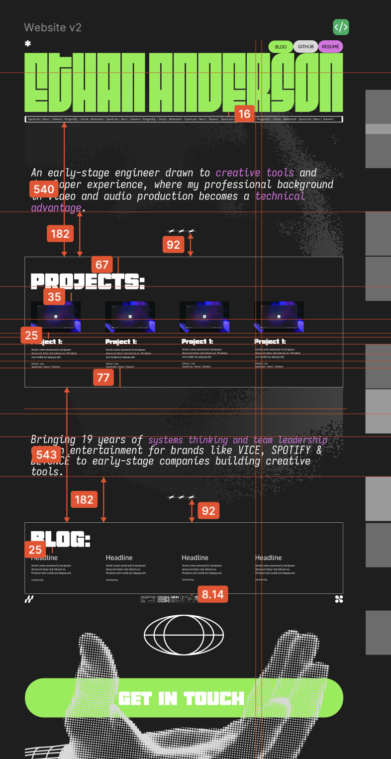 spec.png
Design
Designed, Iterated, Spaced and Specced in Figma to the pixel.
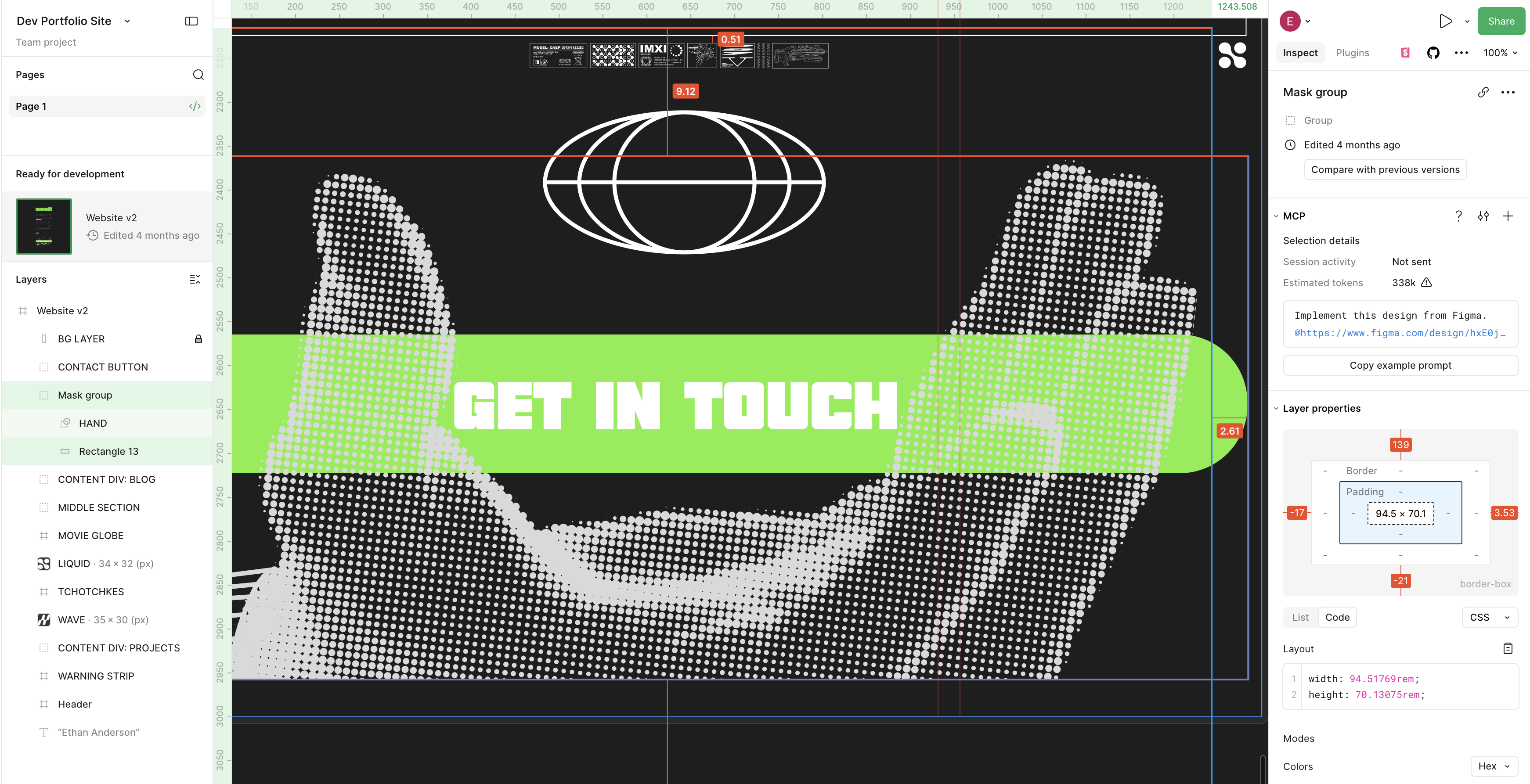 layers.png
Handoff
Structured into semantic layers, then implemented both by hand and via the Figma Desktop MCP bridge.
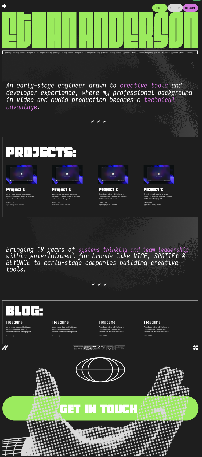 build.png
Build
Leaning on Astro's "component island" architecture, Astro components and plain HTML render the layout statically, while React components hydrate interactivity. JavaScript ships only where it moves.
Color Palette
Typography
Buttons & CTAs
Card Components
A brief description of the project content goes here showcasing multiple lines.
GitHub | LiveREACT | TYPESCRIPT | TAILWIND
A brief description of the project content goes here showcasing multiple lines.
GitHub | LiveNEXT.JS | SUPABASE | FIGMA
A brief description of the blog post content goes here with insights about development.
Read More...ASTRO | WEB DEV | DESIGN
Spacing System
Motion
Tchotchkes
Decorative ornamental designs scattered through the site for texture.



Design Tokens Summary
| Token | Value | Usage |
|---|---|---|
| Colors | ||
| --color-bg | #1c1c1c | Primary background |
| --color-text | #fefefe | Primary text |
| --color-accent | #7fee40 | Accent — CTA, highlights |
| --color-accent-secondary | #e071e3 | Hover / secondary accent |
| --color-button-text | #1c1c1c | Text on accent-colored buttons |
| --color-subtle | rgba(255, 255, 255, 0.7) | Subtle text (70%) |
| --color-muted | rgba(255, 255, 255, 0.5) | Muted text (50%) |
| Typography | ||
| --font-fit | 'Fit' | Portfolio name |
| --font-guisol | 'Guisol' | CTA button |
| --font-iosevka | 'Iosevka Fixed' | Bio italic; section headings |
| --font-barlow | 'Barlow Condensed' | Nav buttons, card title/description/link/details |
| Sizing | ||
| Nav buttons | 100px × 50px | Radius 40px |
| CTA button | 800px × 158px | Responsive, no max-width; radius 77px |
| Portfolio layout | 1280px | Fixed max-width |
| Type Scale | ||
| Portfolio Name | 100px | Fit |
| Section Titles | 100px | Iosevka Fixed, uppercase |
| Bio Top | 45px | Iosevka Fixed, italic |
| Bio Bottom | 40px | Guisol |
| Card Title | 30px | Barlow Condensed, uppercase |
| CTA Button | 85px | Guisol, uppercase |
| Nav Buttons | 22px | Barlow Condensed, 800 weight, uppercase |
| Transitions | ||
| --transition-fast | 200ms ease | Hover states |